Circle (Alt + O)
A versatile tool for highlighting significant chart areas.Usage
- Highlight important price areas
- Mark peaks and valleys
- Identify overbought/oversold regions
- Draw attention to price spikes
Drawing Steps
- Select the Circle tool from the drawing toolbar or use Alt + O
- Click to set the center point
- Move cursor to desired radius
- Click again to complete the circle
Customization
- Line color and thickness
- Line style (solid, dashed, dotted)
- Fill color and transparency
- Enable/disable fill
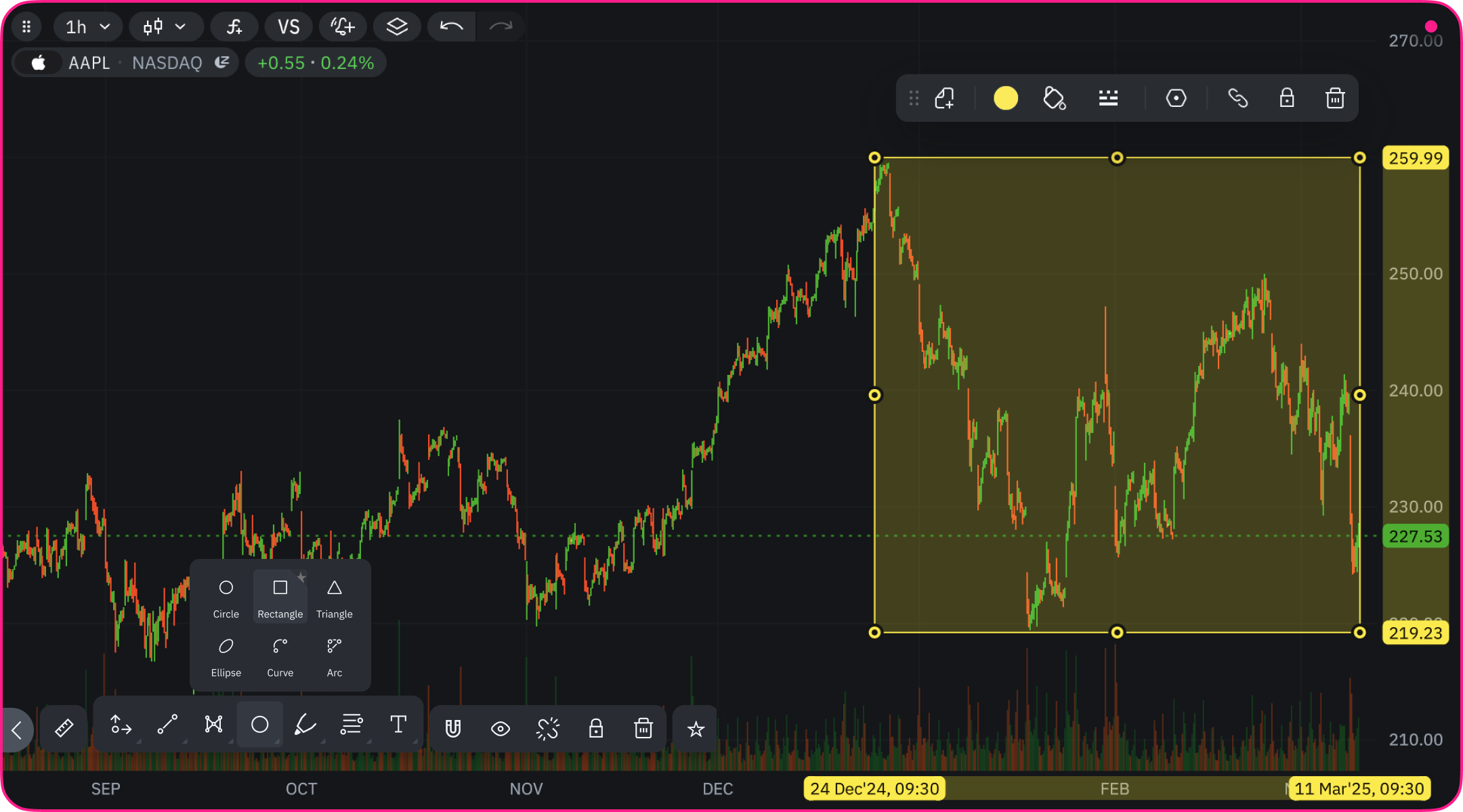
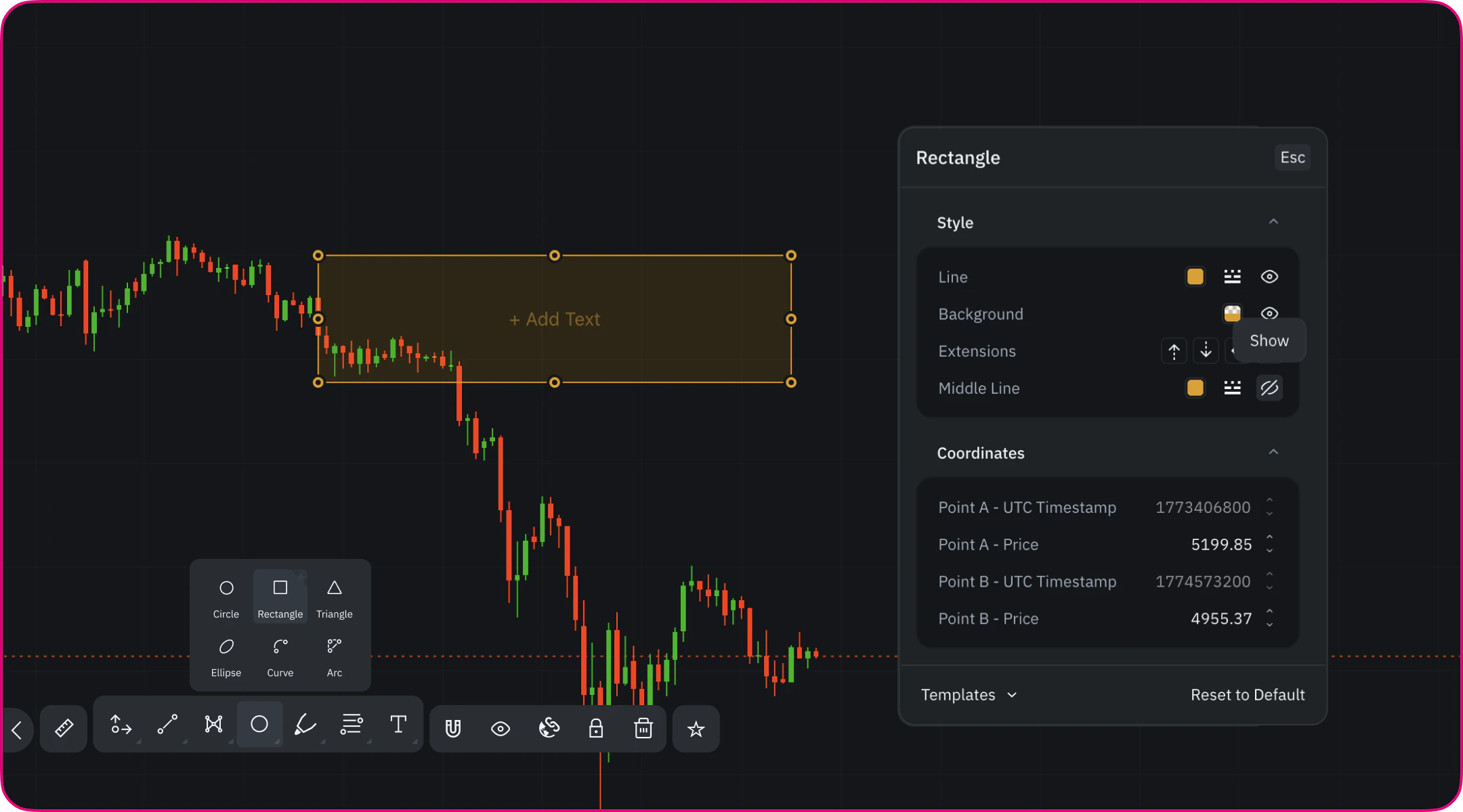
Rectangle Tool (Alt + R)
Drawing a Rectangle
- Select the Rectangle tool from the drawing toolbar or press Alt + R
- Click on the chart to set the first corner
- Drag the cursor to define the opposite corner
- Release the mouse to place the rectangle
Style Settings
Line
- Enable/disable the rectangle border
- Change line color
- Adjust line thickness
- Select line style (solid, dashed, dotted)
Background
- Enable/disable background fill
- Set background color
- Adjust transparency to keep price action visible
Extension Options
The Rectangle tool supports directional extensions that allow zones to project beyond their original boundaries.- Extended Top — extends the upper boundary infinitely upward
- Extended Bottom — extends the lower boundary infinitely downward
- Extended Right — extends the rectangle forward into future bars
- Extended Left — extends the rectangle backward into past bars
- Projecting support and resistance zones into the future
- Defining price ranges without fixed vertical limits
- Keeping historical zones relevant on live charts
Middle Line
- Enable Middle Line to display a horizontal 50% level inside the rectangle
- Useful for:
- Identifying equilibrium levels within a range
- Tracking mean price reactions
- Structuring accumulation and consolidation zones
Additional Controls
- Visibility toggle — quickly show or hide the rectangle
- Templates — save and reuse predefined rectangle styles
- Reset settings — restore default rectangle parameters
Triangle Tool (Alt + G)
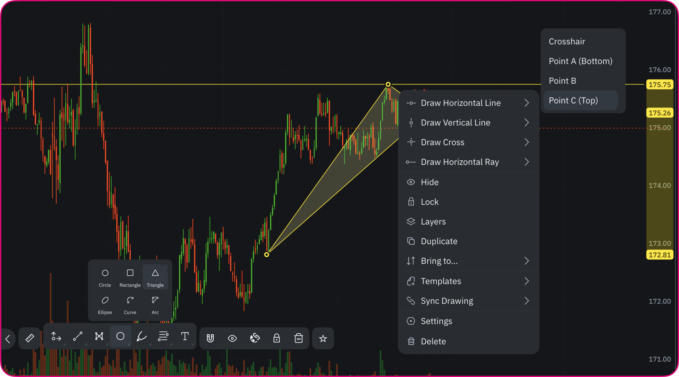
Drawing a Triangle
- Select the Triangle tool from the drawing toolbar
- Click on the chart to place Point A (base point)
- Click again to place Point B
- Click a third time to place Point C and complete the triangle
Style Settings
Line
- Enable/disable triangle borders
- Change line color
- Adjust line thickness
- Select line style (solid, dashed, dotted)
Background
- Enable/disable background fill
- Set fill color
- Adjust transparency to preserve chart readability
Anchor Points and Context Actions
Each triangle point (A, B, C) can be selected individually. From the context menu, you can:- Draw horizontal or vertical lines from a specific point
- Draw a horizontal ray from a selected vertex
- Use point-based references for precise level marking
Practical Applications
The Triangle Tool is ideal for marking classic chart patterns including:- Symmetrical triangles (converging trendlines)
- Ascending triangles (flat resistance, rising support)
- Descending triangles (flat support, falling resistance)
- Pennants and flags
Ellipse Tool (Alt + Shift + O)
The Ellipse tool creates oval-shaped highlights to emphasize important chart areas. More flexible than a circle, the ellipse can be stretched to cover elongated price regions or time periods.Drawing an Ellipse
- Select the Ellipse tool (Alt + Shift + O)
- Click to set the starting point
- Drag to define the shape and size
- Click again to complete the ellipse
Customization Options
Line Properties
- Adjust line color
- Change line thickness
- Select line style (solid, dashed, dotted)
Background Options
- Set fill color
- Control transparency
- Enable/disable background fill
Practical Applications
- Highlight price gaps in the market
- Mark overbought or oversold regions
- Circle significant price peaks and valleys
- Emphasize divergence between price and indicators
- Identify seasonal or cyclical price patterns, etc.
Curve Tool (Alt + K)
The Curve tool creates a flexible curved line that can be adjusted to follow price movements that aren’t straight. Unlike straight trendlines, the curve can adapt to gradually changing market conditions.Drawing a Curve
- Select the Curve tool (Alt + K)
- Click to place the starting point
- Click again to set the end point
- Adjust the curvature by moving the middle control point
- Click to finalize the curve
Customization Options
- Change line color and thickness
- Adjust line style (solid, dashed, dotted)
- No fill option - curve is a line only
Practical Applications
- Draw curved trendlines for non-linear price movements
- Map gradual transitions in market sentiment
- Highlight rounded tops or bottoms
- Create custom support and resistance curves
- Draw freeform annotations
Arc Tool (Alt + Shift + K)
The Arc tool creates a curved segment with fill capability. Unlike the Curve tool, the Arc forms a sector shape with the area between start and end points filled.Drawing an Arc
- Select the Arc tool (Alt + Shift + K)
- Click to set the starting point
- Click to place the ending point
- Adjust the curvature using the control point
- Click to complete the arc
Customization Options
- Line color, thickness, and style
- Fill color and transparency
- Enable/disable background fill
- Add custom text directly to your arc directly on the chart or by using the dedicated text editor block found in the specific arc settings menu
Practical Applications
- Highlight cup and handle chart patterns
- Mark cyclic price movements
- Visualize price projections based on historical swings
- Identify rounded reversals
- Create Fibonacci arcs manually