Chart comparison
Using Comparison Tools
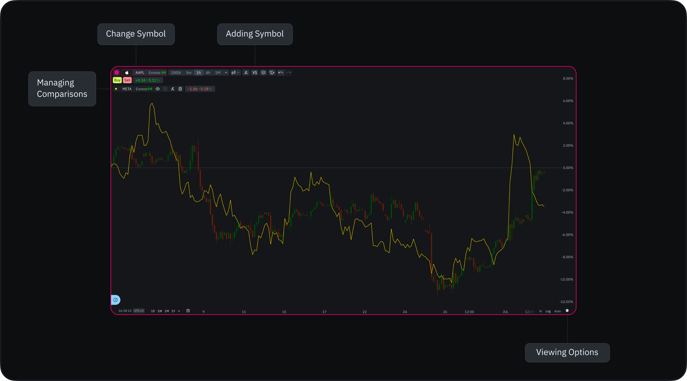
Adding Instruments
- Click the “VS” icon on your chart
- Use the search window to find instruments
- Select instruments to overlay on your chart
- Add multiple instruments for comprehensive comparison
Viewing Options
- Default view: Percentage mode for easy relative comparison
- Alternative: Switch to absolute values in bottom panel
Percentage view often works better when comparing instruments with different price ranges or volatility.
Managing Comparisons
- Each compared instrument appears as a colored line
- Hide instruments: Click the eye icon
- Remove instruments: Click the bin icon
- Customization options coming soon:
- Line colors
- Line types
- Additional display settings
Performance Considerations
- Add as many instruments as needed
- Remove excess comparisons if you notice slowdown
- Consider removing unused comparisons for optimal performance
Go to date
Instantly navigate to a specific date in the chart’s history without manually scrolling back through past price action.- Locate the calendar icon on the bottom panel of your chart
- Click the icon to open the calendar dropdown menu
- Select your desired month, year, and day
- The chart instantly snaps to your selected date
Accessing Drawing Tools
The drawing toolbar appears when you hover your mouse over the chart area. It contains 8 tool categories:- Measures
- Lines
- Patterns
- Shapes
- Drawings
- Fibonacci
- Text