Main idea of drawings
This section describes another way to visualize data. It is convenient for:- displaying data that is not a time series;
- changes and erasures of previously drawn elements;
- displaying something not only in chart coordinates (time-price), but also, for example, just in the corner of the screen on top of the chart;
- displaying something in the future or retroactively;
+ it is a very powerful tool that can significantly increase the informative value of the indicator;
- this is more difficult to write and debug than working with time series. To control the drawing of elements, you will need the
self.chart object, which is available in your indicator by default as part of the MainContext base class. You can do three things with objects:
- adding a new element to the chart
- changing what was drawn earlier, even if it was drawn on previous bars
- removing an item from the chart
Very basic example of drawings usage
Line drawing
- AbsolutePosition - the item’s position is set in chart absolute coordinates (time-price), the item will scroll along with the chart;
- RelativePosition - the item’s position is set relative to the edges of the chart, the element will hang in one place on the screen on top of the chart.
vertical_anchor and horizontal_anchor set which point of the element will be bound to this position.
top_bottom_ratio and left_right_ratio set how large margins should be made from the left and upper edges of the chart.
There are no presets for absolute positions, they are always set by the user:
LineSegment
LineSegment serves as a versatile tool for lines, segments, and rays. You can customize the line style, color, width, as well as adjust the ends of the segment (arrows, circles, etc.). For a complete list of parameters, see the Library Reference. Below is a simple example with segments. An indicator that creates lines across the entire history with a length of 3 bars (configurable by parameter), connecting close candles:Shapes: Rectangle, Circle, Triangle, Channel
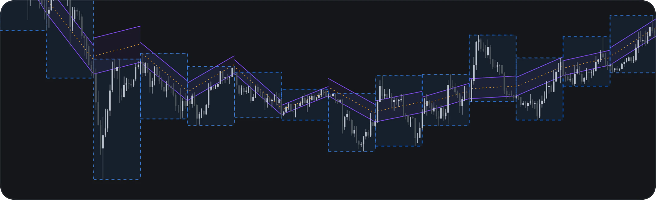
Indie drawings also support several shape primitives built on top of absolute chart coordinates:Rectangle— two corner points, optional fill and middle line.Circle— center point plus a point on the edge.Triangle— three corner points.Channel— two anchor points plus a width in price units.
Rectangle & Channel
Rectangles and channels are commonly used to highlight price ranges, consolidation zones, or trend corridors. In the example below we tile rectangles to mark the high-low range of each 20-bar window and overlay a channel that follows the close-price trend:Range boxes and trend channel
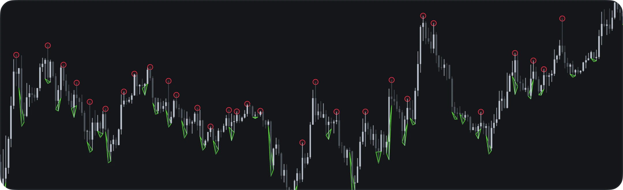
Circle & Triangle
Circles and triangles can serve many purposes — marking significant patterns, annotating key price levels, or drawing attention to specific chart events. To demonstrate how they work, the example below draws circles near swing-high pivots and triangles near swing-low pivots:Swing markers
Label
Labels also have many different parameters, see their list in the Library Reference. Now let’s look at a couple of examples of using labels.Absolute positioned
An indicator that draws a close line and draws a price label for each hundredth bar:Relative positioned
The indicator that draws the close price in the corner of the chart:Demo example: lines + labels
This example shows how you can use lines and labels in your indicators. Add it to your chart and try to play with the drawing items style.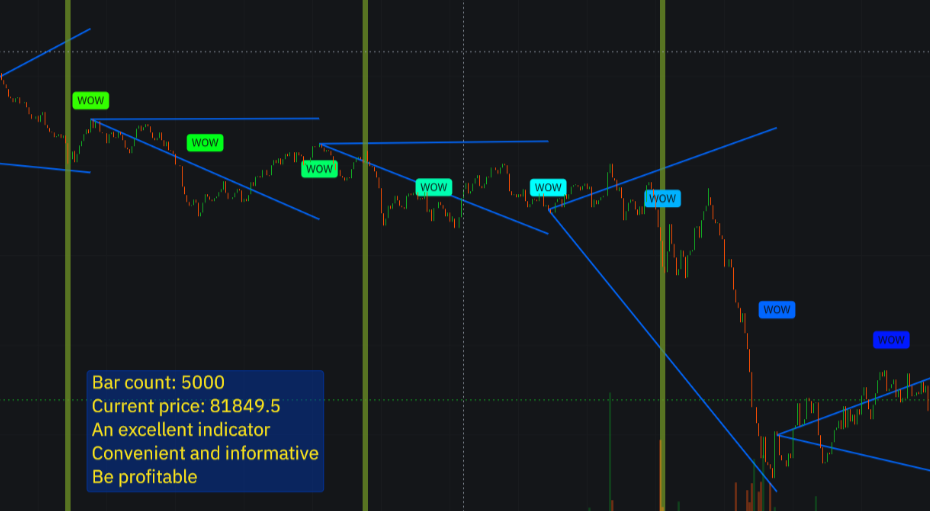
Demo example: + labels