

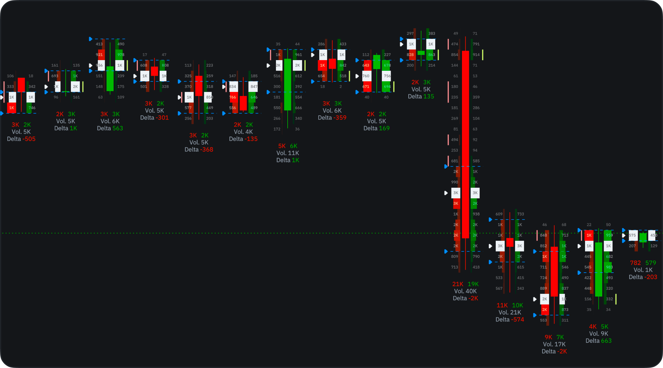
What each cell shows
Every candle is split into price rows, and each row carries the volume that traded at that price. Footprint Type in the settings decides what the numbers represent:- Buy and Sell — buying and selling volume side by side, so you can see which side was more aggressive at a given level.
- Total Volume — all the volume traded at that price.
- Delta — the difference between buying and selling.
Display
- Cluster — the numbers sit inside each candle, centered in their rows. This is the classic footprint read: exact volumes at every price, and the view a new footprint chart opens in.
- Profile — each candle is drawn as a small horizontal histogram. It is easier to scan when you are zoomed out and care about shape rather than exact figures.
Profiles
The Profiles section holds the settings of the price rows:- Profile Style — the colors of the buy and sell sides.
- Row Size — how much price one row covers. Auto picks it for you; smaller rows give a finer footprint, larger rows aggregate the flow into fewer, denser levels.
- Labels — the volume numbers in the rows, shown or hidden.
- POC — the point of control, the row with the most volume, and its color.
Value Area
The Value Area is the price range that holds the bulk of a candle’s volume. It is off by default: switch it on in this section, then set its Style and Ratio (70% by default). It is the same idea as the value area on a TPO chart.Imbalance
Imbalance highlights the rows where buying and selling are far out of balance, instead of leaving you to compare the two numbers yourself. Ratio (300% by default) and Threshold decide which rows count as an imbalance, and Style sets the colors for the buy and sell side.Filters
Filters recolor the rows whose numbers fall within a range you set, so only the prints you care about stand out. Click Add Filter and set it up:- Filter — the color for the matching rows and the value to read: Volume, Buy Volume, Sell Volume, or Delta.
- Range — the Min and Max bounds. Only a Delta filter accepts negative bounds, and only with Absolute Value off.
How to read it
- Wide or bright rows inside a candle mark the prices where the market did most of its business.
- A lopsided buy/sell split, especially a flagged imbalance, shows which side was leaning on the market at that level.
- Stacked concentrations across neighboring candles are the levels worth watching on a retest — compare them with your support and resistance zones to judge whether a level was defended or absorbed.
Alerts on footprint values
Alerts run on price and on indicators, so footprint numbers reach an alert through Delta Vol, a built-in indicator that reads the same footprint data (see CVD and Delta Volume). It draws each candle’s delta as a column colored by sign, or buy and sell volume as opposite columns.- Add Delta Vol to the chart from the f icon.
- Right-click the chart and choose Create Alert on Delta Vol (DELTA), or pick Delta Vol (DELTA) as the Source in the Create Alert form.
- Choose the value, such as Delta, then the criterion and the target — for example, delta crossing zero.
Availability
Volume Footprint needs trade-level data, so it is not available for every instrument — Pepperstone and Exness instruments carry no footprints. It is offered on timeframes of 1 minute and up, not on seconds or ticks. Settings, chart sharing, and chart sync work like they do for the other chart types.Volume Footprint is still evolving — settings and behavior may change between releases. If something looks wrong, tell us in Discord or at support@takeprofit.com.